WordPress is not easy. If you came to this page because you’ve struggled a bit with WordPress (WP), don’t feel badly. Even though I used to be a software engineer and project manager at Hewlett Packard, it took me 2 weeks to develop my first WP site: SoccerMovieMom.com. That is a hobby website that also served as my practice run.
To get started with wordpress, I watched many WP tutorials online at SkillFeed. I had already taken Dreamweaver and Photoshop classes at the local community college over 10 years ago, so I was already familiar with website hosting, ISPs, FTP, etc.
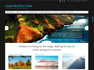
On this page, I am only discussing the Presentation Page of the Cryout Creations’ Tempera 1.2.2 theme, which is what I used to build the primaryapps.com website.
While SoccerMovieMom uses the built-in WP Twenty Fourteen theme in a very static way, I wanted to include a slider of images for my business site. WP 4.0 provided a new way to browse themes, and I quickly found Tempera by searching for certain features I wanted, such as responsive (will work on mobile platforms).
If you have already used wordpress, the difficult part of the Tempera theme is understanding the Presentation Page. Here’s what I learned:
By default, the front page of a WP site shows the most recent posts in reverse chronological order. Tempera instead provides a Presentation Page as a default homepage or splash page, with a slider and 6 static thumbnails of posts with Tempera images and text. This is aka a dynamic front page, combining static content and blog content posts. However, this presentation page is automatically enabled, and it does not show up in your list of pages in your WP Admin view. You must configure it though the Tempera Settings.
To replace the default Tempera info with your own content, do the following:
- Go to Appearance > Widgets and drag the Cryout Column widget to the sidebar called “Presentation Page Columns”.
- When I did #1, the website no longer showed the 6 images and their text. However, the main text of “Tempera is living on the edge” was still there. Edit this text in Appearance>Tempera Settings>Presentation Page>Extras
- “Top Title” field is large text centered under the slider
- Below that, the “Top Text” field is left-aligned and appears above your posts.
- If you disable the Presentation Page, then your homepage reverts to the classic blog of reverse chronological posts.
- If you want to have a classic blog page in addition to the Presentation Page, then create a new empty page and choose “Blog Template (Posts Page)” as the page template. I then added all my pages to the right sidebar, using the Widgets menu.
I added a Header image that appears behind the site Title and Description. It is from a photo of a Persian rug. To get that image to work, I modified the Header settings.
- The default Header image size is 120 px H x 1150 px W
- I set the Header Settings as follows:
- Header Height = 90 px
- Header content spacing = 20 px top (was 40 px)
- Header content spacing = 10 px left (was 0 px)
- I also changed the site title fonts to 38 px Open Sans
- To keep the header aspect ratio when turning landscape or portrait on a mobile device, under Tempera Settings>Header Settings>Header Image check the “Keep header image aspect ratio”.
This is a great article on editing images and thumbnails in wordpress
- In a post, to get text to flow around inserted images, you must edit the image after you insert it. In the wpadmin post editor, Click on the image and then click the align button.
- WP takes the first image in the post and by default uses it as a featured image. In Tempera, this image came out very large on the Presentation Page and in category views. To get the image to be thumbnail size, you must set it to be the featured image for your post, in the bottom right corner of the post editor.


